
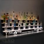
 Display Shelves
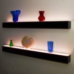 Floating Shelves
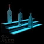 Low Profile Shelves
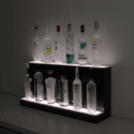 High Profile Shelves
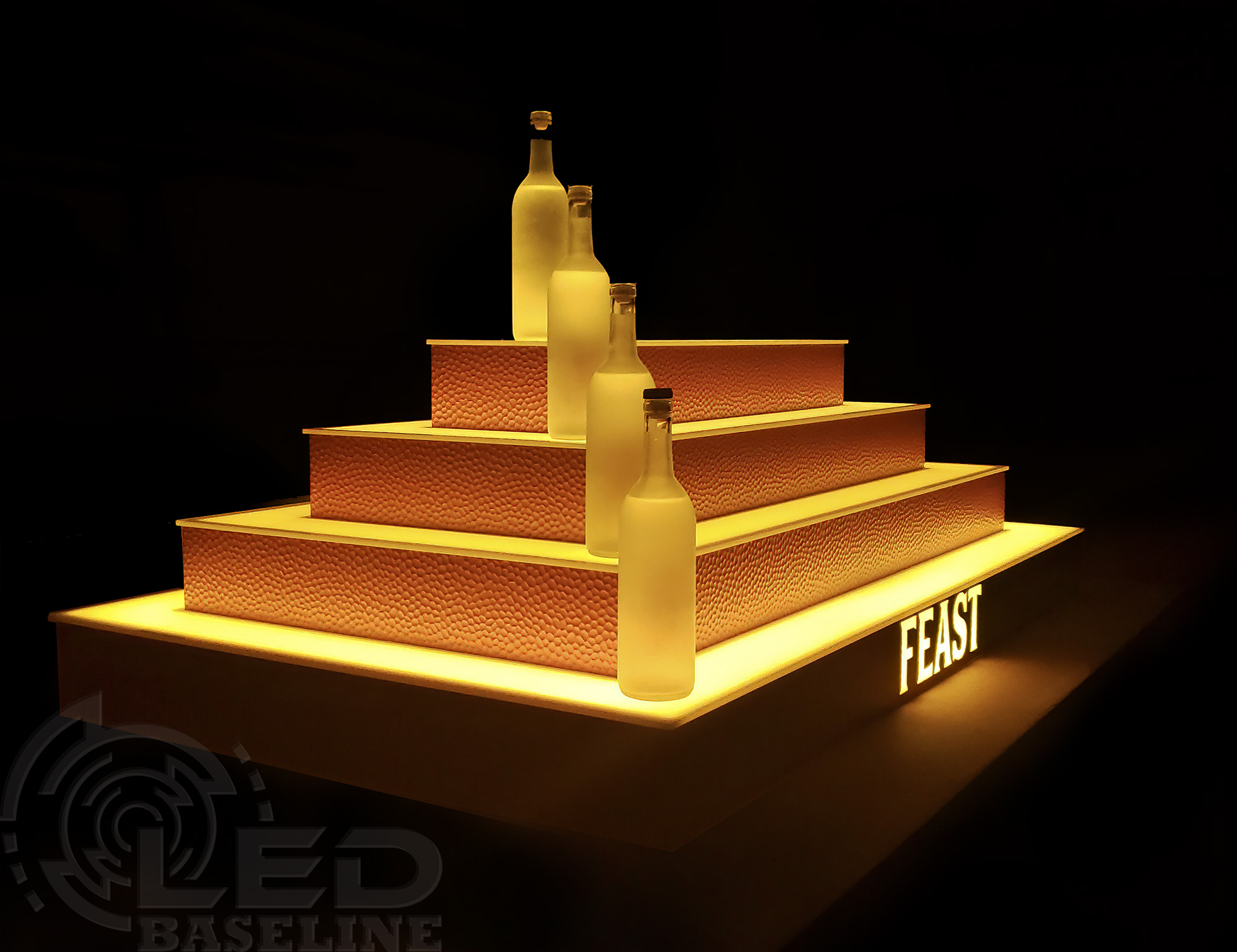 Island Shelves
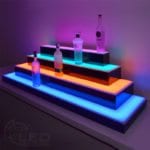 Return Style Shelves
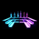 Corner Shelves
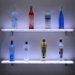 Acrylic Floating Shelves
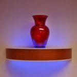 Curved Floating Shelves
 Standard LED Floating Shelves
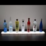 Acrylic LED Display Stands
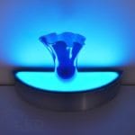 Curved LED Display Stands
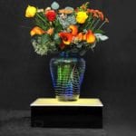 Standard Display Stands
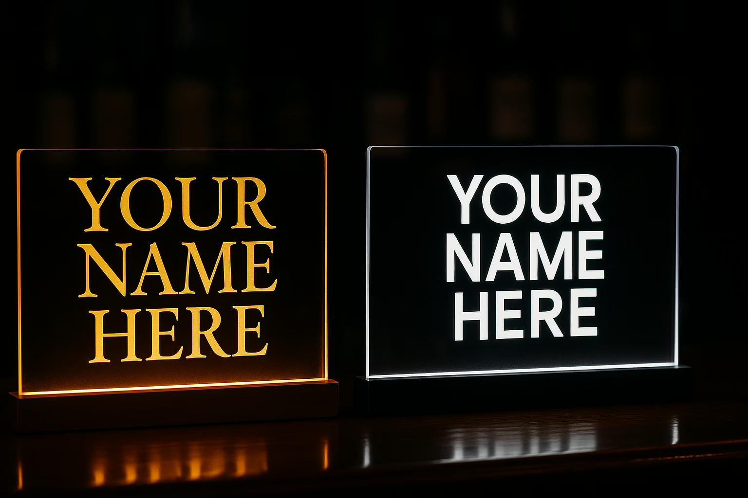
How to choose typefaces for your logo, bar shelf, and lit displays
Fonts do not just spell your name. They set the mood before a guest ever tastes a drink. On a glowing liquor shelf or a lighted display base, the right typeface reads clean, feels on brand, and still looks sharp when the LEDs are doing their thing. This guide shows how to pick fonts that match your vibe and stay legible in low light.
First, pick a vibe
Start with the feeling you want people to have.
- Classic and refined
- Modern and minimal
- Playful lounge
- Speakeasy and heritage
- Bold nightclub energy
Write that single word on a sticky note. Every font choice has to pass that test.
What different font families signal
Serif
Elegant, trustworthy, heritage. Works for speakeasy and craft cocktail brands.
Great picks to test: Kepler Display, Garamond Premier Pro, Cormorant Garamond, Walbaum Display.
Tip: very thin hairlines can fade when backlit. Choose display cuts with stronger hairlines.
Sans serif
Clean, modern, versatile. Reads well at distance and on acrylic.
Great picks: Gotham, Avenir Next, DIN, Futura.
Tip: geometric sans gives a cool, club feel. Humanist sans feels warmer.
Rounded sans
Friendly and approachable. Good for lounges and casual concepts.
Great picks: Gotham Rounded, Avenir Rounded.
Engraved or small-serif
Luxury and old-world craft. Tastes like cut crystal and copper.
Great pick: Engravers MT.
Tip: pair with a quiet sans for menus so the engraved caps do not overpower.
Script and brush
Handmade energy. Strong personality in headlines only.
Use sparingly. Keep stroke thickness even so the glow does not swallow thin strokes.
Display and deco
Instant theme. Perfect for a headliner wordmark, risky for paragraphs.
If you go art deco, test spacing at small sizes so counters do not fill with light.
LED and lighted shelf realities
- Contrast matters. Light text on dark background, or dark text with a light outline, wins in glow.
- Minimum stroke weight. Aim for hairlines that are at least medium weight when seen from six to eight feet. If a hairline vanishes on your phone at thumbnail size, it will disappear on a shelf.
- All caps versus title case. All caps can look sharp on a shelf. If you use all caps, open the tracking slightly so letters do not bleed into the glow.
- Spacing. LEDs exaggerate tight kerning. Add a little breathing room.
- Materials. On acrylic, ultra sharp points can chip. Rounded ink traps and soft bracketing age better.
Pairing fonts without clutter
- Classic pair
Serif display for the logo, clean sans for details
Example: Kepler Display with Avenir Next - Modern pair
Geometric sans for the logo, humanist sans for small text
Example: ITC Avant Garde with Avenir Next - Heritage pair
Engraved caps for the logo, old-style serif for menus
Example: Engravers MT with Garamond Premier Pro - Playful lounge pair
Rounded sans for the logo, neutral sans for details
Example: Gotham Rounded with DIN
Keep it to two families max. The glow already adds visual noise.
Quick process that works
- Choose three candidates that match your vibe.
- Set your name in all caps and in title case at the sizes you actually use on a shelf.
- Add tracking tests at zero, plus twenty, plus forty.
- Put the mockup on a lit shelf at party brightness and at ambient brightness. View from across the room, then from arm’s length.
- Check the problem letters. S, R, E, and N are the first to go fuzzy.
- Adjust. If hairlines disappear, switch to a display cut or increase weight. If the word feels cramped, open the tracking.
Recommendations by concept
Speakeasy or heritage
Kepler Display, Garamond Premier Pro, Engravers MT
Why it works: curved bracketing and classic proportions read as refined, and the caps look great in metal or acrylic.
Modern nightclub
ITC Avant Garde, Gotham, DIN
Why it works: clean geometry and even strokes stay crisp against color fades and music sync lighting.
Craft cocktail with a warm twist
Cormorant Garamond, Walbaum Display, Avenir Next
Why it works: a little romance without fussy details, still legible on a glowing edge.
Playful lounge or patio bar
Gotham Rounded, Avenir Rounded
Why it works: softer corners feel friendly and photogenic on warm white light.
Common pitfalls
- Choosing a Didone with ultra thin hairlines for a tiny logo. Pick a display cut or strengthen the hairlines.
- Stacking three fonts. Two is powerful, three is clutter.
- Forgetting real-world tests. Always check at night with the shelf glowing.
- Tight kerning. Glow expands shapes. Give letters room.
Free or budget-friendly options
- Cormorant Garamond
- Playfair Display
- Prata
- Montserrat for a geometric sans feel
- Raleway for a sleek sans headline
These read clean and are easy to license for web.
Final checklist before you lock your logo
- Does the font match the single word on your sticky note
- Can you read it from six feet on a lit shelf
- Do the E arms and S spine hold up at small sizes
- Is spacing open enough for glow
- Do you have only two families across logo and details
Need help testing on a lit shelf?
If you are unsure which to choose, we can prepare several logo mock-ups in your preferred typefaces for direct comparison before final approval.
👉 Ready to pair the right font with the right light
Explore our LED liquor shelves and display bases to see how type reads in glow.
Need inspiration? Check out our gallery to see what other people have chosen!
Need signage? Contact us for a quote!